Reharmonising the past to orchestrate the future of a major jazz ensemble.
NYJO
Scope
Logo
Brand Identity
Brand Guidelines
Print Design
Digital Design
Social Media Design
Also known as the National Youth Jazz Orchestra, NYJO is an organisation founded in 1965 dedicated to making jazz and creative music-making more accessible to early-career musicians, young people, and audiences across the country. Throughout their activity, they seek to create a meeting ground between the established and the experimental – the past, present, and future – to build bespoke programmes which cater to lifelong and new jazz fans.
About the client
NYJO approached me to help with a full rebrand as they felt their current identity didn’t match how they had evolved as an organisation and where they were going. At this point they had been around for 56 years and since then have become more than just an orchestra, they had new products, there was naturally new culture and it felt like the perfect timing for them as they were about to move into a new home at Woolwich Works in South East London.
About the project
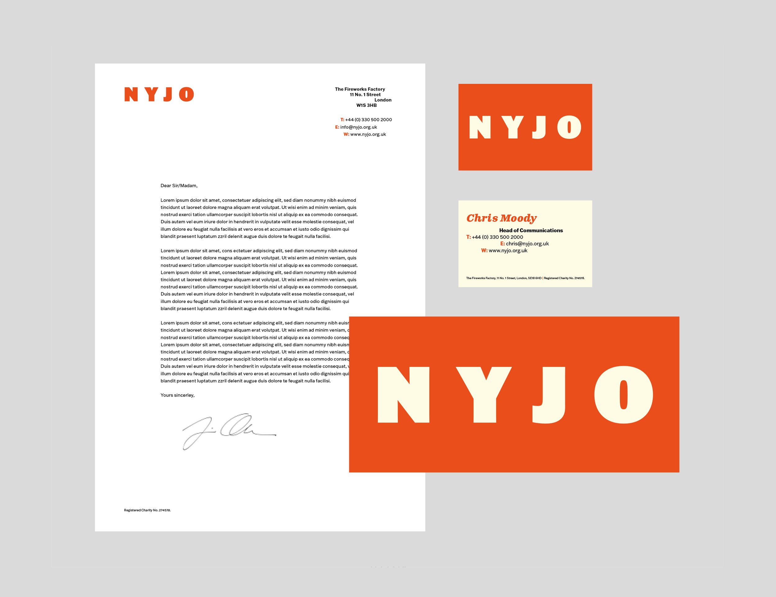
A key part of the brief was to craft an identity that drew inspiration from jazz’s visual legacy, particularly the bold, iconic look of Blue Note, Atlantic, Prestige etc album covers. NYJO wanted a design system that would always feel relevant within the world of jazz, something that spoke to its history but also felt alive and contemporary. The challenge was to strike a balance, to create something timeless that resonated with audiences across different generations while still embracing jazz’s ever-changing, boundary-pushing nature.
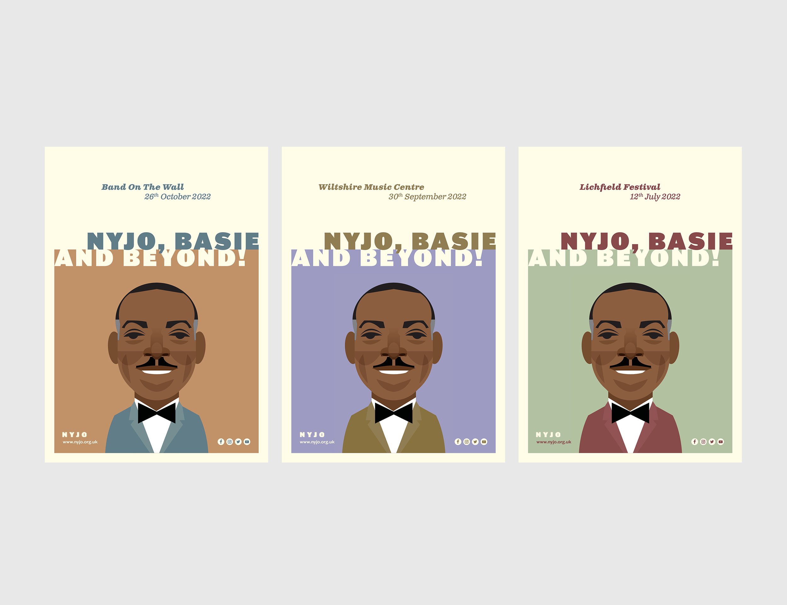
Typography played a crucial role in achieving this. Franklin Gothic, an American typeface that was both designed and popularised during the Jazz Age, was chosen for its deep-rooted connection to jazz history and its ability to still feel fresh today. This was paired with Clarendon, a British typeface from the late 19th century that, much like jazz itself, has stood the test of time while featuring in many jazz album covers. The interplay of these typefaces, combined with deliberate shifts in text alignment, mirrors the improvisational energy and rhythmic complexity of jazz music.
Beyond typography, the identity’s layout and composition were designed to reflect jazz’s unique blend of structure and spontaneity. Drawing from the graphic language of classic jazz visuals, the design incorporates bold, dynamic layouts and striking contrasts that feel both sophisticated and expressive. This is complimented by vibrant Jazz-esque colour choices and stunning, characterful illustrations by the brilliant Manchester-based illustrator Stan Chow, helping to visually connect NYJO’s brand with the movement, personality, and storytelling of jazz.
The result is a visual identity that feels deeply authentic to jazz, past, present, and future. By blending historical references with a contemporary design approach, NYJO now has a brand that instantly signals jazz while remaining fresh, relevant, and engaging for the next generation of musicians and audiences alike.


