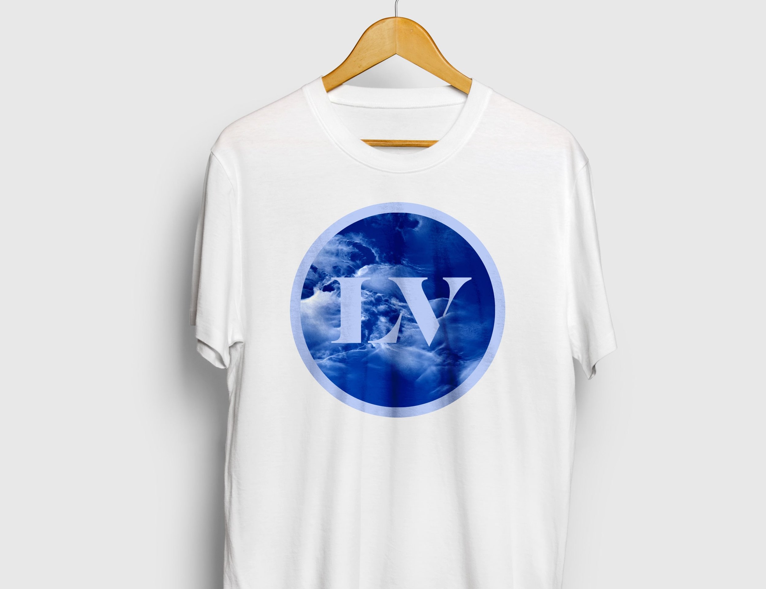
Logo redesign for a liquid drum & bass record label, crystallising their identity after a decade of evolution.
Liquid V
Scope
Logo
Cover Art
Merchandise
Print Design
Sister to the legendary Drum & Bass record label V Recordings, Liquid V was set up in 2004 to release a deeper, funkier sound known as ‘Liquid Drum & Bass’. With releases from the likes of Peshay, Calibre, D-Bridge, Artificial Intelligence, Commix, Logistics, Nu:Tone and more the label has a well respected artist roster and a back catalogue to be proud of.
About the client
With the label running for over ten years Liquid V approached me to redesign their logo. The brief was to create a stronger image whilst still retaining the existing heritage of the brand and logotype.
They were keen to create an ‘LV’ symbol that had a clean and classic look and one that in time could be recognisable without the need of the logotype.
About the project
As Liquid V were keen to keep the look and heritage of the existing brand the initial focus was around the logotype. Looking at and researching engraved typography the outcome is a more refined and sleeker version of it’s predecessor.
For the ‘LV’ symbol the concept of engraving was explored further and the outcome is a clean, simple yet distinctive icon centred around an engraved ‘LV’ monogram.
It was decided that the logo should not be tied down to any specific colours. With every release having it’s own theme and colours the logo was created to be adaptable so that it can be treated with the same colours and/or image as the album or single artwork it is being presented on.


